Editor’s note: Here is a top 10 of the best data visualisations according to the blog Awesome Infographics, and they are pretty good indeed! Now we want to hear about you: what is your top data visualisation? Have you come across a stunning infographic lately? Tell us in the comment section..
ONE
Visualising Alcohol Use: What Percentage of the U.S. Drinks Regularly?
Image may be NSFW.
Clik here to view.
Brought to you by Phlebotomist.net
TWO
The World’s Resources by Country
Image may be NSFW.
Clik here to view.
Credit: British Geological Survey
THREE
A HAND DRAWN infographic. Non of that inDesign bullshit for this guy.
Image may be NSFW.
Clik here to view.
FOUR
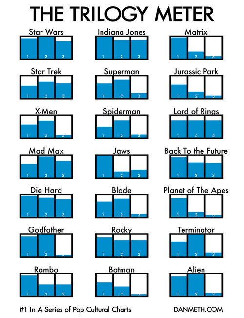
The Trilogy Meter
Image may be NSFW.
Clik here to view.
FIVE
The Jedi Trainer’s Guide to Employee Management
Image may be NSFW.
Clik here to view.
Thanks to www.MindFlash.com for this one. [Read more…]
